Yes, its another Dribbble invite giveaway but this time, instead of the normal ‘show me your best work’ type of affair I’m going to try something a little bit different.
If you don’t know about Dribbble – and every web designer really should by now – it’s a fantastic community for web designers, graphic designers, icon designers and pretty much anyone related to the design world. You can post images of your latest web design or icon design and get feedback from the design community. It’s also great to see what other designers are doing and what trends there are in web design. Don’t use Dribbble for your only source of inspiration though, make sure you find inspiration from everywhere otherwise you’ll find you’re just copying the latest trends and not pushing your design skills to their limits.
Most Dribbble invite giveaways usually mean sending in your best design work and waiting until someone decides you’ve won. In the past I’ve tried this and it’s been very difficult. Sometimes you get a lot of very good design work and it’s hard to choose, other times the quality is very low and there’s just no one you feel is good enough. Dribbble have a very good system that keeps track of people you’ve drafted in so if you draft in someone thats not so good then it reflects badly on you. So, you always want the best designers possible to apply for the invite. With that in mind I have a plan…
- Send me a link on Twitter to @kcwebdesign of a live website you’ve designed.
- Spread the word of this Dribbble invite giveaway on as many social networks as possible (I’ll be tracking the links).
- The person with the best website design and most links back to this article wins the invite.
Wait a minute, he’s just trying to get back links! Well yes, and no. It’s a bit of an experiment in social media network coverage and how big peoples networks are these days. Do most people have a Twitter and Facebook account or are there many more social networks that people use on a daily basis. Once the Dribbble invite giveaway is over maybe I’ll publish the results so people can see the usage of social networks…if it works, it may not!
Over the past few months we’ve been working with QRBT and Geocel (part of Ronseal) to produce a brand new responsive website design for Geocel to showcase their huge range of building and DIY products.
Objective
To create a modern, responsive website for Geocell to bring the brand up-to-date and allow users to view all of Geocells products.
Goals
To allow users to browse and search all Geocells products and allow merchants to login to see merchant specific offers and product information.
Solution
The website was built using Expression Engine with additional modules to handle the complex structure and layout of the products and categories. Products needed to be shown under different top level headings and in multiple categories to enable the user to quickly find products by brand, usage or product name.
Every product in the range has a huge amount of additional information that the user can access but this information is mainly used by building trade professionals. kc web design kent built a user friendly front end system that was easy for the user to find and download this extra information and an intelligent admin system for Geocel to manage their products quickly and easily.
More and more trades-people are now using mobile devices and the building trade in general in the UK is amazingly quick at taking up mobile technologies so the new website had to be responsive and offer an optimum experience on all mobiles and tablets.
Merchant areas, stockists maps and other features will be added over the coming weeks as the website grows.
Visit website
At kc web design kent we’ve been working with Fujitsu UK and Fujitsu Global on a number of exciting projects for a while now. The latest project for Fujitsu UK is a complete redesign of their UK blog. Last year we created a brand new WordPress blog for Fujitsu UK that was quietly launched and gradually built up over the coming months. After the success of the first 12 months and a massive increase in readership it was time to revamp the website and create a brand new responsive design.
kc web design kent worked very closely with a great team at Fujitsu UK to design and build a new blog website that would enable a large amount of written content to be viewable on a multitude of different devices. A unique look and feel was created by kc web design kent to differentiate the blog from other Fujitsu websites while keeping within the strict brand guidelines. Unique identifiers were created for each of the 5 main sections that would allow users to easily scan different stories on the site. The layout was kept simple but intuitive to maximise the readability of the content and minimise distractions.
To create the responsive website design kc web design kent utilised the fantastic Twitter Bootstrap responsive framework to build the WordPress theme templates and create a truly universal viewing experience on all devices. The in-house design team at kc web design kent used a combination of apps and technologies to build the initial templates including Twitter Bootstrap, Coda 2, LESS, LiveReload, Hammer and Ghostlab for testing on our suite of different devices. Using this suite of Mac products enables us to design responsive websites swiftly while being able to view as we build on lots of different devices.
Other projects that kc web design kent have been working on with Fujitsu include social media branding, contact and business lead user flow and processes, email newsletter design and more.
Visit website
As well as the website design work I do at kc web design kent I also work with a number of other large companies as a website design consultant and project designer. One recent website design project I was involved with was on a series of projects for the CIOB (Chartered Institute of Building). As well as designing banners and other promotional material I was asked to re-design the Carbon Action 2050 website with our partner company – Hydrant.
Hydrant were the project leaders, I designed the website and it was built by CIOB dev team (i01). Not quite the unified team I’m used to working in and not being able to have a hand in the development of the site was very difficult (and ultimately I think it effected the final product) but all in all it was a great website design project to work on.
The new Carbon Action 2050 website is an important website for the construction industry pushing the boundaries of what can be done to make the building industry more eco-friendly…
The CIOB Carbon Action 2050 toolkit is an action plan of simple, practical steps that can be taken by the Institute, its members and the wider construction industry to reduce carbon emissions from the built environment. Now. Anywhere in the world.
The Carbon Action 2050 website was designed to make the information more engaging and create a sense of value to the information. Reducing carbon emissions in the construction industry is an important mission and so the website design needed to be in keeping with the CIOB global styles but also offer a unique identity of its own while making the wealth of information easy to find and read.
The website is responsive and works on all mobile devices although the exact implementation of this wasn’t carried out by Hydrant or myself.
At kc web design kent we’ve spent the last few months building a new website for a well known sealants and glues company (Not Unibond, the other one!). It’s a large project and the final website design will allow users to view a lot of products in a lot of different categories. Products can be listed in multiple categories such as products, brands and applications and be shown on the website in lots of different places. To accommodate the large number of categories kc web design kent needed to build a flexible, intuitive navigation system that was easy to find products and easy for the client to administer from the backend. As we were using Expression Engine for the CMS we knew it could handle this type of layout but what we found was that the structure wasn’t so intuitive for the client and the categories started to get very messy and not easy to code flexible navigation systems.
Expression Engine has a good community and a wealth of plugins so after searching around we came across GWcode Categories. This simple plugin makes it incredibly easy to create complex category navigation systems with Expression Engine and meant that here at kc web design kent we could construct some very flexible templates to deal with products from any number of categories and show relevant nested navigation levels without having to build duplicate templates for each category. The flexibility it gave us has made building this new responsive website much, much easier than using the standard EE tags.
While building the navigation systems we also came across some small issues with using the EE {segment} variable and so after a bit of Googling we came across Low Seg2cat. Again, this simple plugin opened up a world of possibilities and in conjunction with GWcode Categories enabled us to create some very complex templates and category navigation systems.
Finding solutions like the two mentioned above are why here at kc web design kent we love using Expression Engine. Its hugely flexible, has great support, is client friendly and cost effective. If you need a new website built on one of THE best content management systems available then give kc web design kent a call today.
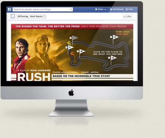
kc web design kent were asked by a leading major travel brand to help create a Facebook App competition for the up-coming launch of the new Ron Howard (A Beautiful Mind, Apollo 13) film – RUSH.
The Rushracer Facebook app was design by the in-house design team at this leading travel brand and built and coded by kc web design kent. The Facebook app was built using the Facebook app API and features some advanced SVG animations to show the stage of the competition round an F! race track. Users can vote on which team they want to win – Team Hunt or Team Lauda – and prizes are won at different stages of the game. All the standard social media mechanisms where used to promote the game through Facebook and Twitter and the competition will run throughout September.
kc web design kent worked very closely with the in-house design team and have created a compelling app targeted at a specific age range. For more information about the Facebook app and the new RUSH film please visit the app.
Visit Facebook App
WordPress has come a long way since it’s early days as a simple CMS. At kc web design kent we used to build bespoke e-commerce systems for big wholesale clothing companies that would take months to develop and integrate with internal stock management and ordering systems. These days we don’t do many bespoke e-commerce solutions but we do still create e-commerce website design here at kc web design kent. The costs involved in creating a bespoke e-commerce web design solution are high and can be prohibitive to most businesses so these days we tend to use different solutions.
There have been some very good e-commerce packages in recent years including the noes debunked Trading Eye and the very good, and still with us, Lemon Stand. At kc web design kent we’re experts in WordPress and Expression Engine and these top class content management systems can be used for e-commerce website design. Having created a number of e-commerce website design solution with both of these systems I have to say that WordPress comes top of my list.
The ease of setup and user friendly control panel makes WordPress ideal for small to medium e-commerce solutions. With the addition of the fantastic Woocommerce plugin a feature rich e-commerce website can be designed and built in a very short time and at minimal cost to the customer. The Woocommerce plugin gives website owners a rich suite of tools to deal with products and a complete order management system. Building this on top of WordPress means a whole e-commerce website can be built that our customers can have full control over including all page content, news sections and shop. Woocommerce is built by Woothemes and has a wealth of additional plugins to deal with all sorts of e-commerce features such as payment gateways, invoicing, Google product feeds, EU VAT, wish lists and anything else a modern shop needs.
Even though the combination of WordPress and Woocommerce can enable us to create fantastic e-commerce website designs, like all good e-commerce websites, it’s how that functionality gets translated into a good user experience that matters. Just grabbing a free theme and creating a shop isn’t always the right option. Making sure the buying process and user interface design is intuitive and sticks to standard design patterns is the key to creating a good online buying experience. At kc web design kent we’re experts in e-commerce website design and user interfaces and our bespoke designs will make sure your e-commerce website succeeds.
“kc web design make hand crafted websites…” – that’s what it says on the new kc web design kent homepage. But what do we really mean by hand crafted website design?
There’s been a lot of talk on twitter recently about the word “craft” with a few top web designers saying it shouldn’t be used in the web design industry but I disagree. Kc web design kent do make hand crafted website designs. The word craft, for me, means time, care and attention to detail and doing that with skill and knowledge built up over many years.
At kc web design kent we don’t use tools like Dreamweaver that try and do it all for you, we hand code HTML and CSS from scratch in a text editor like Coda. One thing that has always stuck with me in the 15 years I’ve been doing web design is something a wise old (no longer with us sadly) web designer said to be when I was just beginning…”the clue is in the code”. Hand coding using skill and knowledge means you know the code, you know what you’re writing and that makes it easier to debug. Using a web editor that does it all for you but generates unreadable code isn’t much help in the long term. It pays to learn the basics of web design coding inside out as this allows you to craft your code or design.
I’ll admit, it’s not really the same as spending a whole lifetime learning to craft axes from raw metal and hickory, but I do believe there is a craft to learn and to do it right takes time and skill. Building websites and creating pixel perfect website designs takes time and effort and to me that’s a craft.
If you want hand built website, designed and coded with skill, care and attention to detail then call kc web design kent today.
While struggling with Adobe Inspect today at kc web design kent on a new responsive web design project I saw a very timely tweet by Andy Clarke…
Goodbye Edge Inspect, you subscription based son of a bitch. Hello @ghostlabapp, my new best friend.
I’d never heard of Ghostlab before and had no idea what Andy was talking about but the mention of Adobe Inspect got my attention, especially as I was battling with testing a website design in multiple browsers on multiple devices.
After a brief look at the Ghostlab website (which is very well designed and worth a look just for that!) is was obvious that this app would be incredibly useful at kc web design kent. Ghostlab is an alternative to Adobe Inspect that makes testing responsive website designs very easy. Once the Mac app is installed you can open an existing URL or drop a folder onto the interface and create a new testing project. Once you click on the project you get to open it up in the Ghostlab browser which creates a local server to view the site on.
Now that the project is open and viewable on the local server you can view the website in any browser and on any device just by going to the local IP address shown in the UI. Not only is it very easy to view a single site on lots of devices but whatever you do on one device replicates through all the devices and browsers which is brilliant if you want to test clicks and forms and don’t want to have to repeat a set of tasks in every browser.
It might sound a little complicated but it was simple to setup and get using and straight away I had my test site open in lots of browsers and on my iPhone and Nexus. Tweaking CSS and reloading the page was made even easier because as you reload on one browser it does it on all of them! Ghostlab is well worth a try and its now become THE app we use at kc web design kent for testing our responsive website designs.
kc web design kent are experts in responsive website design. If you need a new website that works on all devices then give us a call.
kc web design kent are proud to announce the launch of a large web app design project for ThermaSolutions. Back in early 2012 kc web design kent were contacted by ThermaSolutions and asked to produce an iOS app for the building and construction industry. After many months of hard work on the iOS app the project was shelved due to various reasons but kc web design kent worked hard with ThermaSolutions to bring something to market that far exceeded the original project scope. ThermaSolutions continued to evolve over the coming months and has now been launched as a web app subscription service.
kc web design kent designed, built and crafted the web app and the new website is now live. The ThermaSolutions web app was built using Expression Engine with the Membrr subscription module to handle the payments and subscriptions. The web app design is fully responsive to enable it to work on all mobile devices as well as desktop browsers and utilises advanced HTML5 and Javascript technology to allow the web apps to work in offline situations for construction staff out in the field with little or no connectivity. All parts of the web app work independently as stand alone apps that can be saved to the iOS device home screen and work like normal iOS apps. This enables the user to have access to a remote web app thats stores their reports but still be able to use the reporting tools and calculators when offline.
An advanced subscription system and seamless payments were integrated into the web app to provide easy access and signup flows for the user. Over the next few weeks kc web design kent will also be producing a hybrid iOS app that will allow users to download selected parts of the web app directly from the Apple app store.
Visit Website
We had a very interesting call at kc web design kent last week from Potable Water Solutions. Potable Water Solutions make the Hydro Voyager 3 – a new solution for purifying contaminated water.
At kc web design kent we love helping out with good causes and Potable Water Solutions needed a quick landing page created for their new water purification system. We had very little time to get something designed for them and needed to take complete control of the whole process so that Potable Water Solutions didn’t have to worry about a thing. We quickly designed a responsive website design landing page that would show some basic information on the Hydro Voyager for potentially interested parties and allow them to make contact. A fuller, more detailed website will be coming in the future but for now anyone interested can at least see how wonderful this project is a what a difference it could make to people in situations were water is scarce or not of great quality.
For more information on this wonderful project take a look at the Hydro Voyager 3 website created by kc web design kent.
kc web design kent were approached by Callagenix back in October 2012 to redesign their current website. Callagenix are a supplier of telecommunication services to businesses and they need to redesign their slightly dated and content heavy website and bring it up to date with a responsive website design. The challenge was to allow the user easy access to the wealth of information on the website but at the same time making it easy for the user to quickly get to information about products and services and allow them to enquire of buy online.
The new website design created by kc web design kent was built on the fantastic Expression Engine and Zurb Foundation with advanced functionality added with bespoke PHP. Plugins were used to enhance the website features and make sure previous blogspot posts could be easily imported. Advanced article tagging for the news section, offsite backups, import and export routines, social media integration and dynamic categories and call to actions were all integrated using Expression Engine. A lot of hard work has been put in to making sure old content was rewritten and external blog posts were integrated into the new website. SEO was a major concern after failings with the previous website and SEO company so content structure was redesigned and advanced SEO integrated into Expression Engine to allow Callagenix staff to produce new pages and articles that would maintain good SEO presence and help improve page rank in organic searches.
The responsive website produced by kc web design kent allows the website to be viewable on all mobile and tablet devices which is very important for a website in a technology based market place. With mobile devices rapidly becoming a large percentage of browsing users its imperative that all modern website designs are tailored to these devices.
After 5 months hard work at kc web design kent the new Callagenix website design went live this week.
Visit Website
We all know we have to do, but finding time to write content for SEO can feel like a chore especially when you’re working all hours on client web design work. Keeping on top of SEO writing and keeping your website full of fresh new relevant content is hard work and something that has to be maintained. We’ve been so busy here at kc web design kent for the last few months that I’ve let the content writing slip a little. I was writing 2/3 articles per week which really helped with the ‘web design kent‘ keywords and meant that kc web design kent were on page 3 for ‘web design kent‘, page 1 for ‘freelance web designer kent‘ and a few others. Unfortunately, after a month or so of not writing many articles and letting things slip a little we have now dropped down to page 6 for ‘web design kent’! Thats a few pages down is as many weeks!
For any online business, staying up in the organic search results is extremely important and this little (unscheduled) experiment shows that you HAVE to keep up with the content writing for your listing to stay consistant. At kc web design kent we know have a hard slog in front of us to get back up to page 3 for ‘web design kent’ and our other search terms. Sometimes, when you’re working hard it difficult to think of things to write about. Checking news websites and setting up Google alerts on related topics can help find inspiration, then it’s just a case of finding the time. Setting aside 15 minutes and writing a new article first thing in the morning is the best way. It gets it done before any other distractions take over. If you find inspiration hits then don’t forget to write as many articles as you can, you can always save them or schedule them for publishing later when you’re a bit stuck for time.
So, the lesson learnt is to stick with it, keep on writing regular articles and stay up in the search listings.
Its been reported quite widely in the media this week that WordPress has been under attack. WordPress powers millions of websites so an attack like this is no small thing. Millions and millions of sites will have been hacked and the brute force attached looks like it was aimed at weak admin usernames and passwords. Probably an attempt to gain access to more servers for a bigger attack, the hackers targeted WordPress websites with weak passwords that were still using the default admin login. Even WordPress websites with different usernames but weak password could still have been compromised. kc web design specialise in WordPress website design in kent and all over the UK and we’ve seen a lot of damage done by this attack.
Whenever we build a WordPress website design here at kc web design kent we take security very seriously. The first thing we do is to setup WordPress on the server then lock it down, harden it and add extra security features. We try and protect it from all of the most well known attacks as well as making sure password policies are tight. There are a few useful plugins we use on every WordPress website design we do as well as using some other tricks to secure config files and other important areas of the WordPress system. There are loads of tutorials around that explain the best practices when securing WordPress so I won’t bore you with a huge article on that. The plugins that we always use and are well worth taking a look at are: Block Bad Queries, Wordfence, Secure WordPress by WebsiteDefender and WordPress Backup 2 Dropbox because if anything does happen to your website you want to get it back up quickly right?
Security on any system is a serious issues so don’t let anyone build you a WordPress website without making sure its secure. kc web design specialise in WordPress website design in kent and all over the UK so talk to use before you decide on creating a WordPress website. We can make sure its safe.
Working in an online business like kc web design kent means that almost every working day I’m logging in and out of services or apps. Every day my whole online life is governed by passwords for email accounts, online web design services, social media, to-do lists and more. It feels like every month or so now some online service gets hacked and we all have to change our passwords again. In the last few months we’ve had Dropbox, Twitter and now Evernote is the latest victim.
On Evernotes website they apologise “for the annoyance” and say that data is safe although passwords were breached. I suppose thats all it has become now, an annoyance. Not the ‘end of the world’ catastrophe we all used to think it was when something got hacked but just an inconvenience and one that we can fix just by changing a password.
The problem with all this is when your daily online life is so full of passwords that you start using the same ones for everything. I know I’ve done this in the past. But with the ease that hackers are gaining entry to major online services its time to be a little more security conscious and make sure you don’t use the same passwords for multiple services. At kc web design kent we use password systems such as 1Password to help remember all our online log ins and to stop the need for having to remember hundreds of passwords. Other systems are available but as we use Macs and iPhones here at kc web design kent then a native app that works on all our devices is our best option.
So don’t take the chance, make sure your passwords are secure and not the same on multiple accounts and use a tool to remember them. This way it stays and annoyance and not a catastrophe when you loose data or find your personal details have been used for something else.
I thought we’d start doing a little Friday round-up here at kc web design kent of interesting things that we’ve come across during the week. So for our first ‘Friday round-up’ we’re going to have a look at all sorts of interesting web design and development related goodies and just plain cool stuff that we’ve come across over the last week.
Zurb Foundation 4
The latest version of the best (in our opinion, although Bootstrap is coming a very, very close second now) responsive html5/css3 framework is out. kc web design kent were invited to the launch party in Mountain View but we decided it was a little too far to travel from Kent!
The new version changes a few things – firstly, it now uses a mobile first approach to its responsiveness, it has better javascript which uses the Zepto framework and the semantic layouts have changed slightly creating cleaner markup but a few changes to the way its used. All in all it looks like a great update to a framework that stays at the forefront of web design tech and website design uses. As they say on the website, Foundation is now future proof.
Handheld Conference
Getting to a good conference is still on my list of things to do (I just never seem to have the time these days!) and if I was going to go to any conference this year it would be Handheld. The line-up is fantastic, it’s in Cardiff which is pretty cool (but a long way from Kent!) and they have a house band to play between speakers! There is also a day of workshops and a big party. Early bird tickets have almost sold out but its still a pretty good price for the line-up. I wish I could go!
Ouya
Lots of great things are coming out of the Kickstarter culture we have at the moment and the funding of some amazing projects is actually happing and products are coming to market. Ouya is an open-source games console running on Android thats going to ship for $99! Just hook it up to your TV, search for the games you want to play online and then buy them. Once some good games are on board this kind of thing could really take off and stop the gaming industry being led by 3 major companies.
MYO – GESTURE CONTROL
Another amazing Kickstarter project is MYO. MYO turns you into a Jedi! It’s basically very cool gesture control that you can hook up to pretty much anything. It’ll work with Mac and Windows and allows you to control things with gestures. Watch the video on the website, its very cool! I think I’d much rather have one of these than Google Glass.
Over the last few months here at kc web design kent we’ve been collecting some useful tools and snippets of code and all sorts of interesting links so I thought we’d share some of those for other web designers out there. First on the list is a great little tool for online typography…
Gridlover is a great tool for creating a html text with a perfect modular scale and vertical rhythm. If setting out your text styles while creating a new website design feels tricky then this well designed online tool will help you create those text style just by dragging a few sliders. Very easy to use and the results are pretty good.
Everyone likes a good texture and pattern to use on a website design and Subtle Patterns is the perfect place to find them. There are all kinds of patterns and subtle textures here to use on your website designs and they easy to find and use. You can even download the whole pack to keep on your own resource folders.
One thing I’ve been using more and more when coding website designs these days is Emmet. It used to be called Zen Coding but after a name change and a big update its now better than ever. Learning a new bunch of syntax’s to use while coding websites in your favourite editor (we use Coda 2 here at kc web design kent) takes a little while to learn but once you get used to it it does make certain takes while coding much quicker. Here’s one I use for expanding a list into options for a select list including the value…
option[value=$#]*>{$#}
It might not seem like much but when you have a select list with lots of options this saves a lot of time! With any complicated expressions like this that I can’t remember instantly I tend to save them as Coda clips so they’re easy to just copy and use.
As more and more mobile phone companies are producing cheaper smartphones the more the mobile market grows. For web designers the mobile market has become very important over the last few years and this is set to grow even more rapidly in 2013. For kc web design kent and other freelance web designers and website design studios, responsive web design (RWD) has now become the normal way to create new websites. Almost all clients now want their new websites to work on mobile and tablet devices and responsive web design is the prefect way to achieve this. With new cheap phones coming onto the market – and rumours that Apple with produce a cheaper version of the iPhone – the number of users with access to the internet via a mobile device is set to grow again. This is one of the fastest growing emerging markets and making sure your website works on mobile and tablet devices is a must these days.
Smaller, cheaper devices have processors from two or three years ago, they have small screens with low resolution, and weaker cameras. They can all do email and the web but gaming and browsing is a much better experience on the higher end phones – Ian Fogg, principal analyst at IHS
Responsive web design doesn’t have to be complicated or expensive. As long as it’s well thought out and planned and your users goals and your business goals are taken into consideration then you can create a fantastic website that works on all devices. At kc web design kent we try and utilise responsive web design in all of our website builds in the right circumstances and this is especially important on web app projects. Ignoring user that will visit your website on tablets and mobiles could reduce sales and exclude a huge demographic so when thinking about your websites update in 2013 please also consider WHO will be using your website and WHAT they’ll be browsing it on.
kc web design kent are experts at responsive web design so give us a call and we can answer any questions you have. Don’t ignore mobile users, talk to kc web design kent to find out how you can tap into this huge market and improve your current website.